|
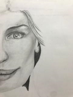
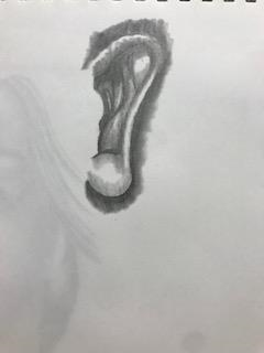
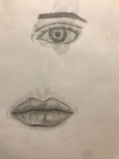
For this assignment, we were supposed to draw our eyes, mouth, and an ear. We were supposed to used pencil and blend the features to make it look very realistic. The picture on the left is my practice drawing, I was watching a video and drawing with the girl in the video.
0 Comments
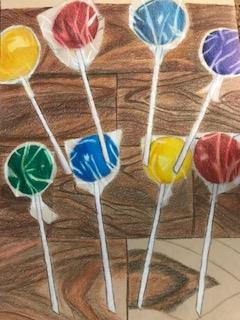
1.Describe the craftsmanship of your drawing. - I feel like my craftmanship of my drawing if very out there but I think it pops, with the color and everything. I believe adding the wood texture in the background made the color of the lollipops glow more. 2.Describe how your background choices help unify the artwork. - I feel like my choice of the wood in the background helped the lollipops stand out more, especially the color, it looks more brighter. I didn't want just a plain old solid color background. 3.Describe your choice of colors. -My choice of colors, in my opinion, was original but the colors I chose are bright and noticeable. I didn't want the lollipops to look boring and bland. I wanted them to stand out. 4. How did you use texture and highlights to enhance your drawing? - I used the wood texture in the background, and I believe it made my drawing look a lot more realistic. In the lollipop wrapping, I added lines of highlight to make it look like the wrapping was a little crumpled up, so you can see the detail in the lollipops. 5. Why did you choose a specific background for your work? - I chose the wooden background because I thought it would make my artwork stand out more, with the brown colors in the background, the lollipops seem to be more noticeable to someone who glances at the art. 6. Describe any challenges you had during drawing. How can you improve this? - At first, I didn't feel like I could succeed drawing this, since I had the draw the see through plastic on the lollipops. I wasn't very confident, but once I practiced enough I started to believe I could do it. One thing I would improve is drawing the plastic part a little brown, so you can see the wood through the wrapping.
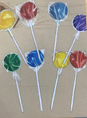
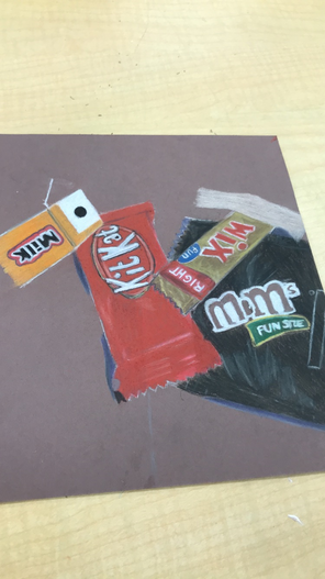
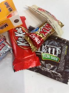
This is my practice sketch before the final piece, it's not very detailed but it gave me the idea of what it will look like. 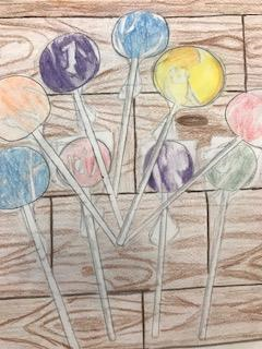 For this assignment we were supposed to draw these candies and really focus on the shadows and highlights using pastel colored pencils.
 The image to the left is the unfinished drawing of this project.
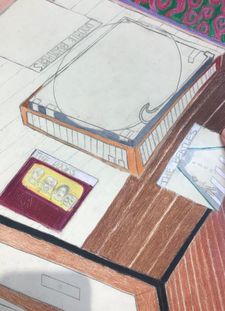
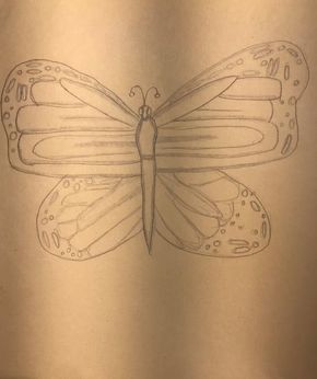
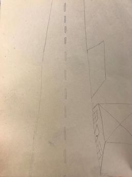
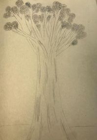
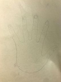
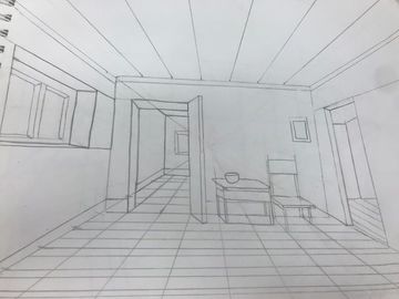
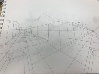
1. Describe how you created an interesting point of view? - I created an interesting point of view by creating an angle that got everything around the record player in the picture. And the way the needle is on the vinyl, I liked this angle because it made the record and record player look unique. 2. Why is it important to understand perspective and how to draw it? - It's important to understand perspective because you need to know the angle of the lines and the vanishing point is very important. If you don't know how to do that, your picture will not look like its at an angle. 3. How were the colored pencil exercises important in the success of your piece? - The exercises helped me a lot in making out the color schemes and making the drawing look more realistic. The exercises taught me how to shade and make colors look darker with other colors, like purple. 4. Describe the craftsmanship of your colored pencil. What techniques were used? - Whenever I wanted a color to look darker, like drawing a shadow for example, I used a darker color like purple to make that color look darker. If I wanted a color to look lighter I colored very lightly and mixed white in with my color. 5. Were you able to achieve depth by showing a foreground, middle ground, and back ground? - Yes kind of, I tried to make a good back ground, but the angle doesn't look quite right. My foreground was pretty good in my opinion. 6. Explain your experience with colored pencil and the project in general. What were the obstacles? - I enjoyed using the colored pencils a lot because they're very neat and have a clean outcome. The obstacles were getting the right color to finish a section. 7. Looking back on the progression of this project what skills, techniques or other information would you like have been taught? Do you feel you were prepared for this project? - I would have liked to been taught more of the perspective skills because I had a lot of trouble with making it look at the right angle. I was sort of prepared for this project, I needed more practice with the perspective drawing skills. These are my assessment drawings I drew in the beginning of the year. I drew a butterfly, a birds perspective of a street, a tree on a landscape, and a drawing of my hand. This was all drawn in pencil.
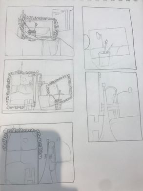 To the left, are my planning compositional sketches for my final drawing. To focus of the shapes of things. 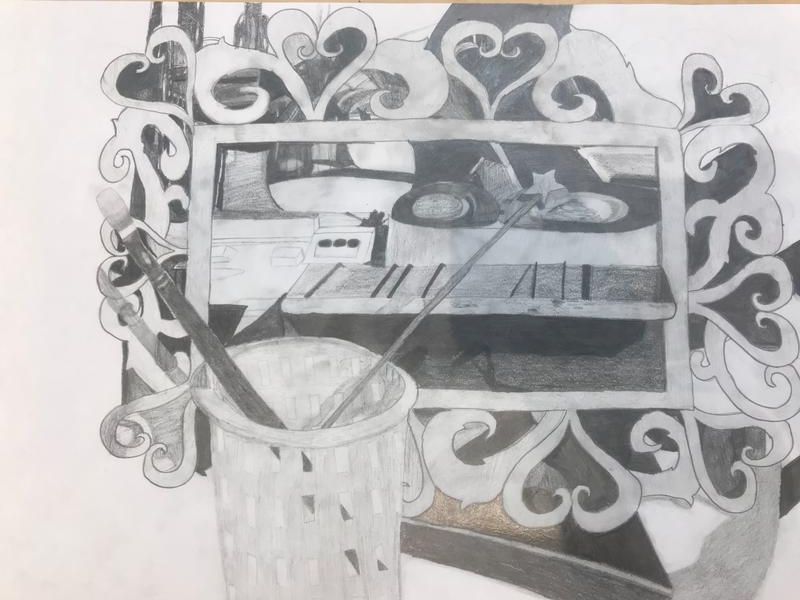 This is my still life drawing from the objects on the table. I had to look at those objects, then draw and shade.
1. Describe the craftsmanship of your drawing - I made sure my drawing had a realistic look to it and tried to make bold lines to notice where all different objects are. 2. Are your values and shadows realistic? How many values did you include? How and why are your values important? - My values and shadows are somewhat realistic, in some parts they are very realistic. I included lots of different values from dark to light, to represent what objects were lighter and what objects were darker. Values are very important because it adds detail to the objects and gives their realistic value. 3. Is there a clear source of lighting? - Yes there is a few sources of lighting in this drawing. For example, on the paint brush handle, you can see the detail in the highlight, where the light is shining. 4. How important were the compositional sketches? Explain. - The compositional sketches were very important because it gave me a good perspective on what I was going to draw. The sketches also gave me practice and a good look on the detail of all the shapes. 5. How is your final drawing successful? - My final drawing is successful because I took my time and got all the good values in, and made sure I tried to make everything the perfect shape. 6. Are the proportions, structure, and perspective of the subject correct? - The proportion needed some work, but its somewhat correct. Some objects were drawn smaller than what the really were. The structure is correct in some parts, like the where the brush basket was placed. The perspective also needed some work because it was tricky to draw this perspective. In my opinion it could've been better. 7. Does the placement and grouping of objects create a pleasing arrangement? - The placement made a good arrangement with the shapes, angles and everything. I can see lots of the objects in the frame. 8. Is there a center of interest and is it well located? - There's not specifically a center of interest, but in my opinion its the big heart frame, because everything seems to be around it and in the middle of it. Yes it is well located in the middle. 9. How well did you manage your time and resources throughout the process of creating this drawing? - I managed my time pretty well, but I believe I needed to focus more so I can add more drawing behind the frame, because there are a lot of blank spots. 10. What challenges did you encounter during this project and how did you overcome them? - A few challenges I encountered was the shading and drawing the shapes all squeezed into the middle of the heart frame. I overcame these challenges by looking more in perspective and trying my best. I also turned my picture on my phone to gray scale to see the values more clearly. 11. What have you learned drawing a still life? This is my white ribbon drawing using a white prisma pencil on black paper. I used this drawing to learn from the white value chart I drew before this. I didn't color certain parts (left it black) to show the shadows on the paper ribbon. 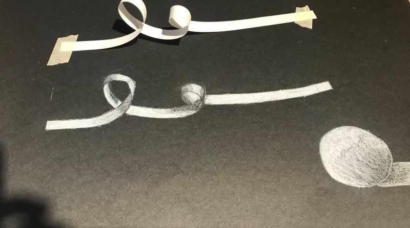
 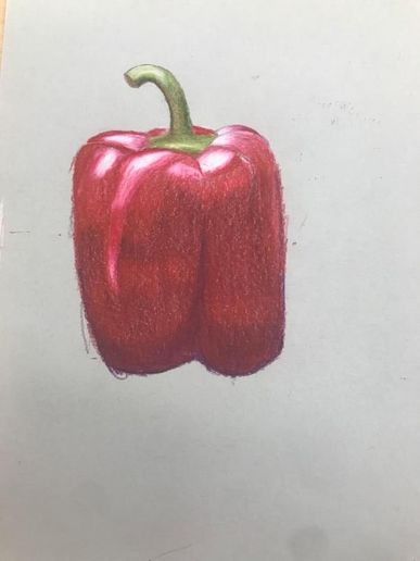 This is my prisma color drawing of a red pepper. I used dark purple, white, red, and pink for the red part of the vegetable. Then I used light brown, white, yellow, and different shades of green for the stem.
|
AuthorWrite something about yourself. No need to be fancy, just an overview. Archives
January 2019
Categories |
 RSS Feed
